FILTER BAR
Persistent Filter Bar with View Transitions
SEAMLESS CATEGORY FILTERING WITH PROFESSIONAL POLISH-NO SCROLL JUMPS, NO LAYOUT SHIFTS.
Persistent Filter Bar with View Transitions
What Makes a Filter Bar Feel Professional
Category filter bars appear simple but require careful attention to preserve user context during navigation:
| User Expectation | Common Failure Mode |
|---|---|
| Scroll position persists | Resets to left on each page |
| Page depth maintained when filtering | Jumps to top on every filter change |
| Click feels responsive | No feedback during navigation delay |
| Cards morph above filter | Filter bar covers transitioning elements |
| Buttons feel consistent | Different behavior on mouse vs touch |
This guide covers the patterns required to deliver a polished filtering experience with Astro’s View Transitions API.
Current Implementation
Filter Button Styling
Filter buttons use a neobrutalist press animation with transform and shadow changes:
.filter-btn {    /* Smooth transitions for press effects */    transition: transform 0.1s ease-out, filter 0.1s ease-out, box-shadow 0.1s ease-out;    /* Resting shadow position */    box-shadow: 6px 6px 0px 0px var(--nr-shadow-color);    /* Resting position */    transform: translate(0, 0);}
/* Hover: subtle brightness increase */.filter-btn:hover {    filter: brightness(1.05);}
/* Press: Button drops toward shadow (neobrutalist effect) */.filter-btn:active,.filter-btn.pressing {    transform: translate(2px, 2px);    /* Move toward shadow */    box-shadow: 4px 4px 0px 0px var(--nr-shadow-color);  /* Shrink shadow */    filter: brightness(0.95);}
Key design decisions:
- Neobrutalist press effect - button drops 2px toward shadow, shadow shrinks proportionally
- JS-triggered
.pressingclass - ensures animation plays even during fast navigation - Works identically on mouse and touch devices
- Adjacent elements stay stable - transform doesn’t cause layout shift
DOM Persistence
The filter bar uses transition:persist to survive page navigations:
<div id="work-category-filter-container" transition:name="work-category-filter-container" transition:animate="none" transition:persist> <nav id="work-category-nav" transition:persist> {categories.map(cat => ( <a href={`/work/category/${slugify(cat)}`} class="filter-btn">{cat}</a> ))} </nav></div>What persistence preserves:
scrollLeftposition- Event listeners
- Ongoing CSS animations
Required manual handling:
- Active button styling (must update via JS after swap)
Scroll Position Restoration
const SCROLL_KEY = 'filterScrollPos';const PAGE_SCROLL_KEY = 'pageVerticalScroll';
// Before navigation - save positionsdocument.addEventListener('astro:before-preparation', () => {  const nav = document.getElementById('work-category-nav');  if (nav) {    sessionStorage.setItem(SCROLL_KEY, nav.scrollLeft);    sessionStorage.setItem(PAGE_SCROLL_KEY, window.scrollY);  }});
// After swap - restore positionsdocument.addEventListener('astro:after-swap', () => {  const nav = document.getElementById('work-category-nav');
  // Restore filter bar scroll  const savedScroll = sessionStorage.getItem(SCROLL_KEY);  if (nav && savedScroll) {    nav.scrollLeft = parseInt(savedScroll, 10);  }
  // Restore page scroll for filter-to-filter navigation  const isFilterNav = sessionStorage.getItem('workFilterNavigation') === 'true';  if (isFilterNav) {    const savedPageScroll = sessionStorage.getItem(PAGE_SCROLL_KEY);    if (savedPageScroll) {      window.scrollTo(0, parseInt(savedPageScroll, 10));    }  }});
Active Button State Sync
Persisted elements bypass server rendering, so active styling must be updated via JavaScript:
document.addEventListener('astro:after-swap', () => {  const nav = document.getElementById('work-category-nav');  const currentPath = window.location.pathname.replace(/\/$/, '');
  nav?.querySelectorAll('a').forEach(btn => {    const href = (btn.getAttribute('href') || '').replace(/\/$/, '');    const isActive = href === currentPath;
    if (isActive) {      btn.classList.remove('btn-outline');      btn.classList.add('btn-accent');      btn.setAttribute('aria-current', 'page');    } else {      btn.classList.remove('btn-accent');      btn.classList.add('btn-outline');      btn.removeAttribute('aria-current');    }  });});
Responsive Fade Overlays
Fade overlays indicate scrollable content. Width varies by viewport:
<div id="filter-fade-left" class="absolute left-0 h-12 top-1/2 -translate-y-1/2 w-8 sm:w-10 lg:w-16 bg-gradient-to-r from-base-100 to-transparent pointer-events-none z-10 opacity-0"></div>JavaScript controls visibility based on scroll position:
- Left fade: visible when
scrollLeft > 0 - Right fade: visible when
scrollLeft < maxScroll
Animation Timeline & Z-Index Layering
When navigating between detail page and list view, multiple animations must be choreographed:
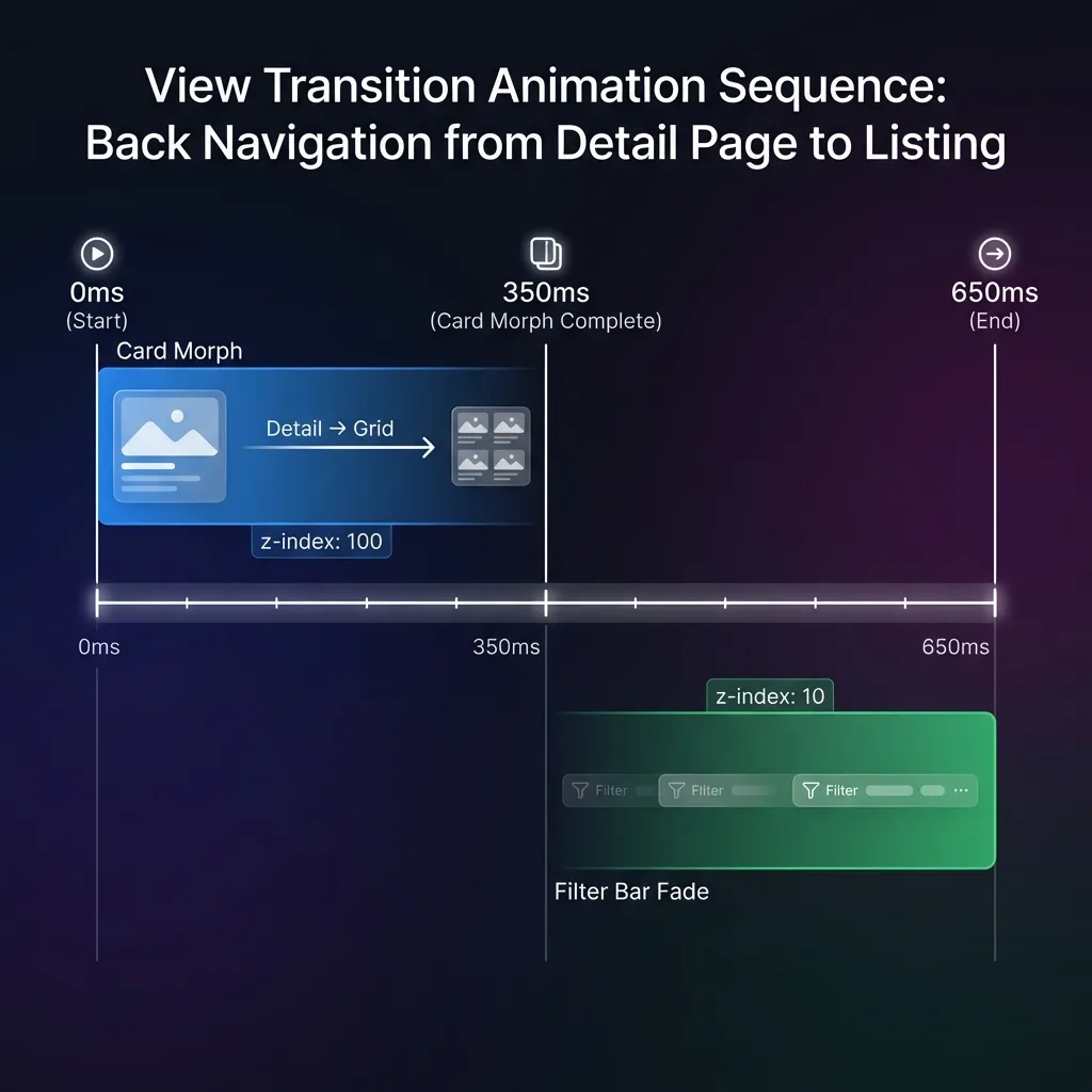
The Sequence
- 0-350ms: Card morphs from expanded detail → small card
- Card elements have
z-index: 100so they fly above everything
- Card elements have
- 350-650ms: Filter bar fades in with 0.3s ease-out
- Filter bar has
z-index: 10so cards pass over it
- Filter bar has
CSS Implementation
/* Cards fly ABOVE the filter bar */::view-transition-group(work-card),::view-transition-group(work-img),::view-transition-group(work-title) {    z-index: 100;    animation-duration: 0.35s;}
/* Filter bar stays BELOW cards */::view-transition-group(work-category-filter-container) {    z-index: 10;}
/* Delayed fade-in AFTER card morph completes */::view-transition-new(work-category-filter-container):only-child {    animation: filter-fade-in 0.3s ease-out 0.35s both !important;}
The :only-child Selector for Appear/Disappear
The filter bar animations should only fire when it appears (back navigation) or disappears (forward navigation)-not during list-to-list filtering:
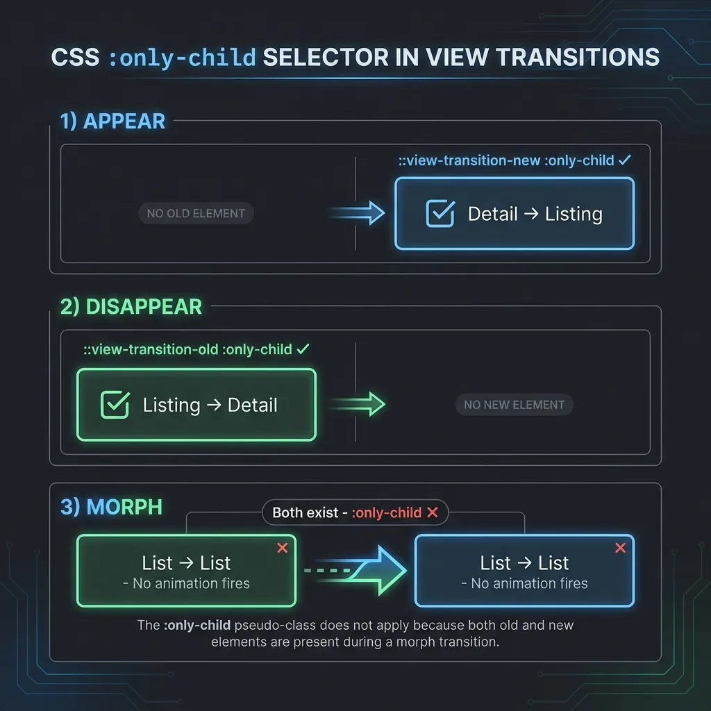
- APPEAR (Detail → List): Only
::view-transition-newexists::view-transition-new(...):only-child✓ matches
- DISAPPEAR (List → Detail): Only
::view-transition-oldexists::view-transition-old(...):only-child✓ matches
- MORPH (List → List): BOTH exist
- Neither
:only-childmatches - no animation fires
- Neither
Architecture Summary
| Pattern | Purpose |
|---|---|
| Neobrutalist press animation | Button drops 2px toward shadow, shadow shrinks |
JS .pressing class | Ensures animation plays during navigation |
| transition:persist | Filter bar survives navigation, keeps scroll position |
| Z-Index Layering | Cards (100) fly above filter bar (10) |
| Nav text transition:name | Text stays visible above nav-active-bg (z-index 1 > 0) |
| :only-child Selector | Fade animations only on appear/disappear |
| Work cards: smaller press | 1px translate vs filter btn’s 2px |
Lessons Learned
❌ Avoid: Complex JavaScript Hover Management
Early iterations tried to manage hover state with JavaScript:
- Inline style locks (
btn.style.transform = ...) mouseleaveevent handlers- sessionStorage to persist clicked button href
- Touch device detection for timeouts
Problems encountered:
- Inline styles were lost during view transition DOM swap
- Race conditions between
astro:after-swapand browser repaint - Couldn’t distinguish between hover and active states reliably
- Different behavior on touch vs mouse created complexity
Solution: Use CSS-only with no transform effects. Simple filter: brightness() works identically everywhere.
❌ Avoid: Hover Lift Effects on Filter Buttons
Neobrutalist button “lift” effects (transform: translate(-2px, -2px)) look great on regular buttons but cause problems for filter buttons:
- View transitions interrupt the lift state
- Buttons “bounce” during page navigation
- Mobile touch has no hover, so inconsistent experience
Solution: Keep filter buttons in fixed position, use brightness change for visual feedback.
❌ Avoid: Transform Effects That Change Visual Footprint
transform: scale(0.97) on press caused the filter bar height to shift by 1-2px because it changes the button’s visual bounding box.
Solution: Use filter: brightness() which has zero layout impact.
✓ Do: Disable Animations During Persist Morphs
When the filter bar persists from one list to another, you don’t want animations firing. The :only-child selector ensures that animations only apply during appear/disappear scenarios.
✓ Do: Save Scroll Positions Early
Save scroll positions in astro:before-preparation, not click. The click handler runs after the navigation has started processing.
✓ Do: Normalize URL Paths
When comparing hrefs for active state, normalize trailing slashes:
const currentPath = window.location.pathname.replace(/\/$/, '');const href = btn.getAttribute('href').replace(/\/$/, '');✓ Do: Give Sibling Elements Their Own Transition Names for Z-Index Control
When an element with transition:name (like nav-active-bg) has siblings (like text labels), the siblings can get hidden during transitions because view transition pseudo-elements stack above the DOM.
The Problem:
nav-active-bghastransition:name="nav-active-bg"and animates- Text label has no transition name, so it’s part of parent’s transition
- During transition,
nav-active-bglayer covers the text
The Solution:
<!-- Background with z-index: 0 --><span class="nav-active-bg" transition:name="nav-active-bg" />
<!-- Text with z-index: 1 (MUST have its own transition name) --><span class="relative z-10" transition:name={`nav-text-${item.href.slice(1)}`}>{item.label}</span>::view-transition-group(nav-active-bg) { z-index: 0;}
::view-transition-group(nav-text-work),::view-transition-group(nav-text-approach),::view-transition-group(nav-text-background),::view-transition-group(nav-text-contact) { z-index: 1; /* Text stays above background */}Known Issues
Mobile Jiggle at Transition End
There’s a subtle 1-2px vertical “jiggle” visible on mobile devices when the view transition completes. Playwright tests in mobile emulation show stable positions (no measurable shift), but real devices exhibit this behavior.
Possible causes:
- Browser’s native view transition rasterization
- Safe area inset changes during transition
- Mobile viewport adjustments (address bar show/hide)
Mitigation: The effect is subtle enough that most users won’t notice. Future investigation could explore disabling view transitions entirely for filter-to-filter navigation using data-astro-reload.
Related
- Building an Astro Portfolio with AI-Assisted Development - Parent project overview
- Navbar Active State Morphing - Shared element transitions for navigation